EQD creates revenue opportunities for investors, asset managers and their service providers through exclusive, high quality discussions, data and news. They combine unparalleled access to key investors with market-leading expertise in content creation to drive client returns.
EQD Events and Intelligence services are geared to connect, benchmark and educate individuals on investment strategy with a focus on volatility instruments and alternative risk premia systematic solutions.
Client
EQDerivatives
Sector
Capital Markets
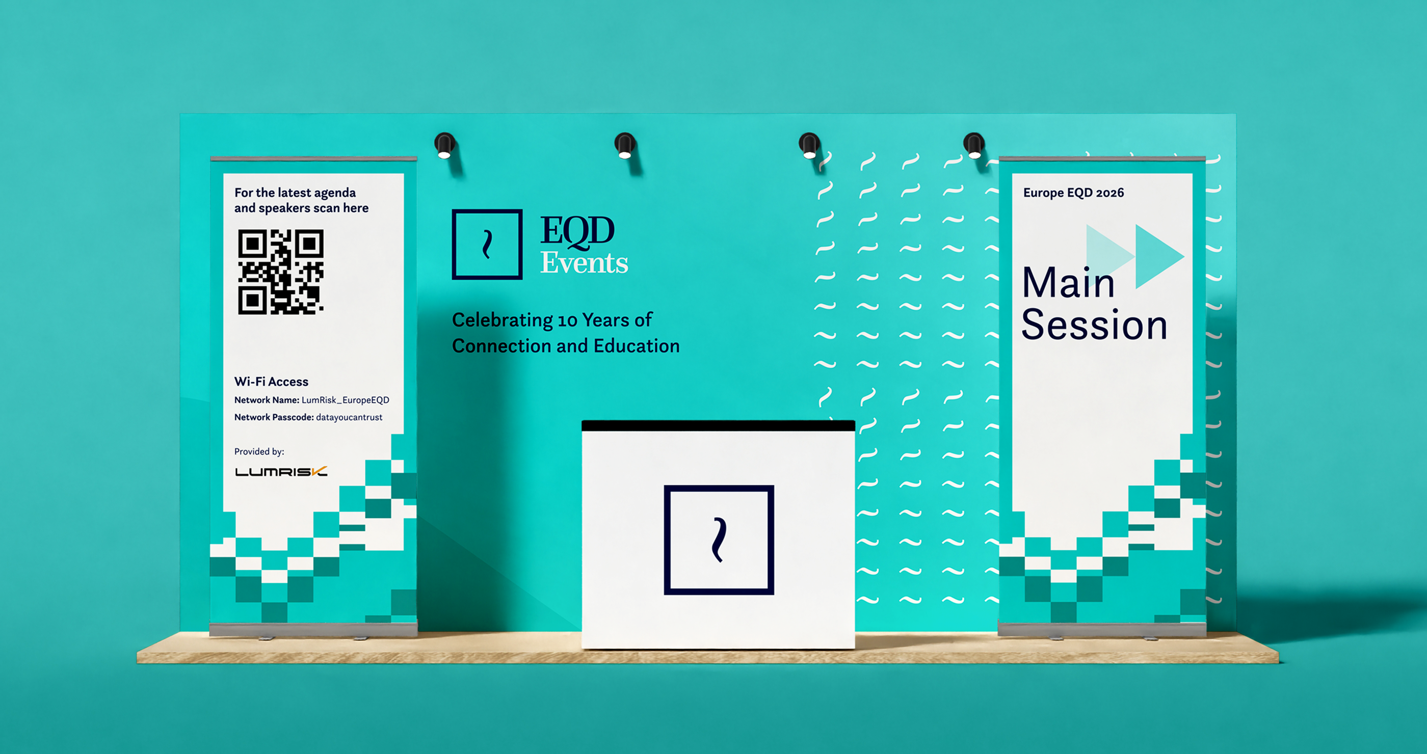
Events
News
Project Scope
Branding
Visual identity


The challenge
EQD’s brand no longer reflected its significant evolution over the past five years, failing to align with current trends.
The out-of-date identity hindered visual communication across both internal and external channels, limiting EQD’s ability to effectively engage with its new and existing client base. We were tasked with delivering a comprehensive rebrand to ensure a modern, future-proof and impactful presence.
Making connections
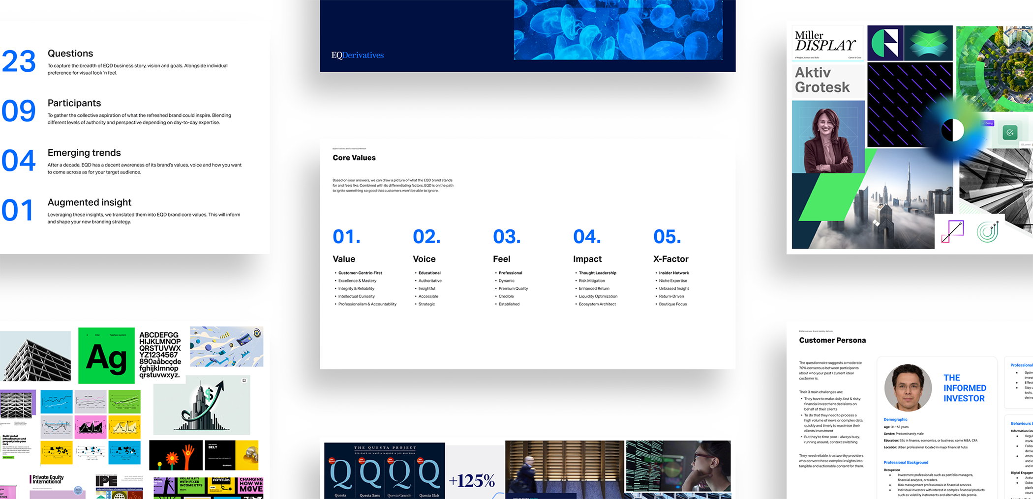
A deep discovery phase unveiled emerging trends, creating a strong foundation for the project whilst keeping the stakeholders aligned on the company’s future vision.
We knew we needed to capture a timeless, classic design with a sense of boldness, movement and connection.


Refining & Enriching
It was important to approach this project as an evolution of old to new. Some brand treatments were to be carried through, some evolved and others net new. A familiar EQD but thoughtfully reimagined.

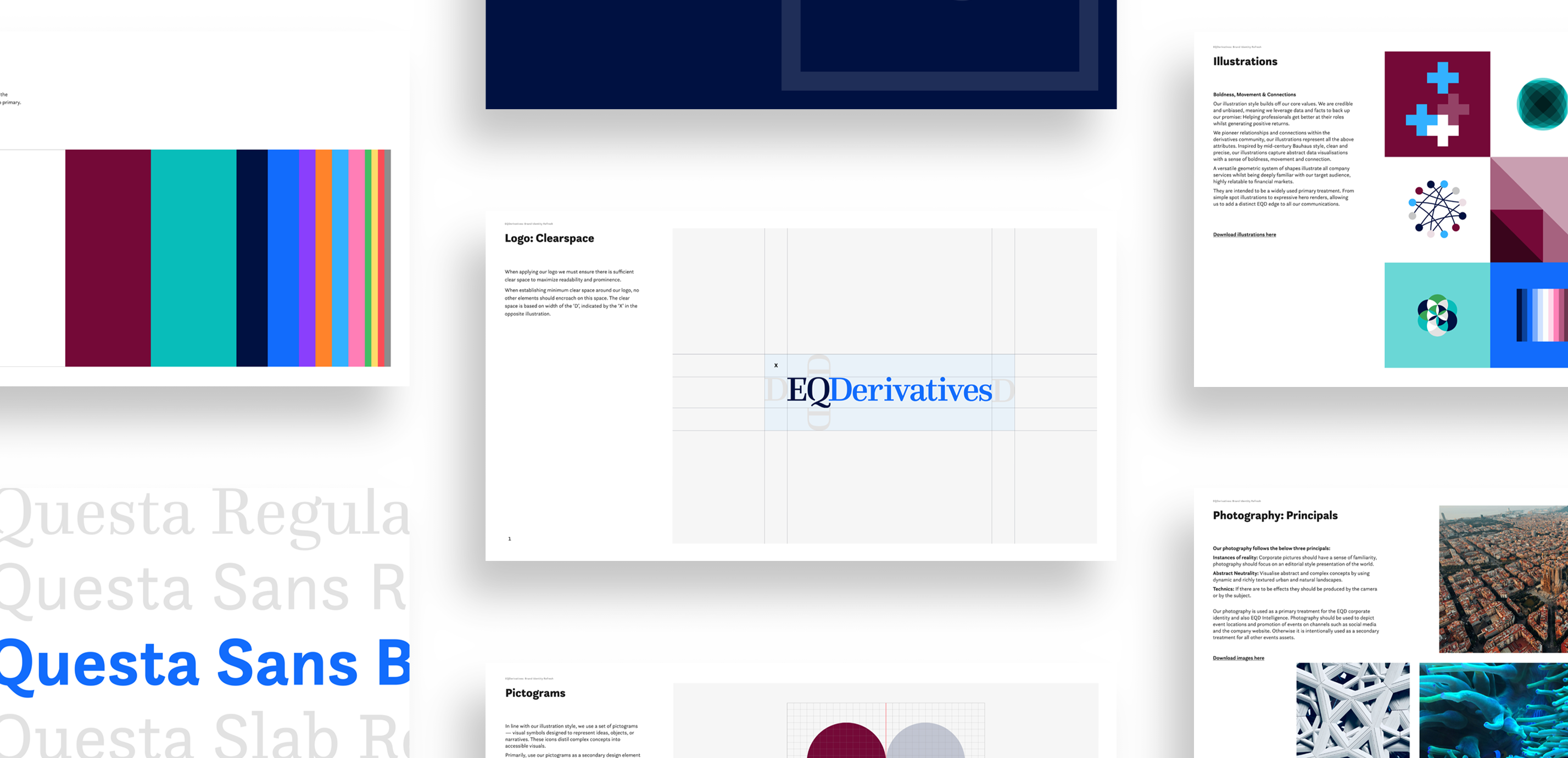
We developed the existing colour palette, giving it a fresh lease of life and a bold character.

Redefining the typography, inspired by the existing logo type was a natural evolution. The Questa Super Family provided us with a large and varied set of fonts to apply across all formats.


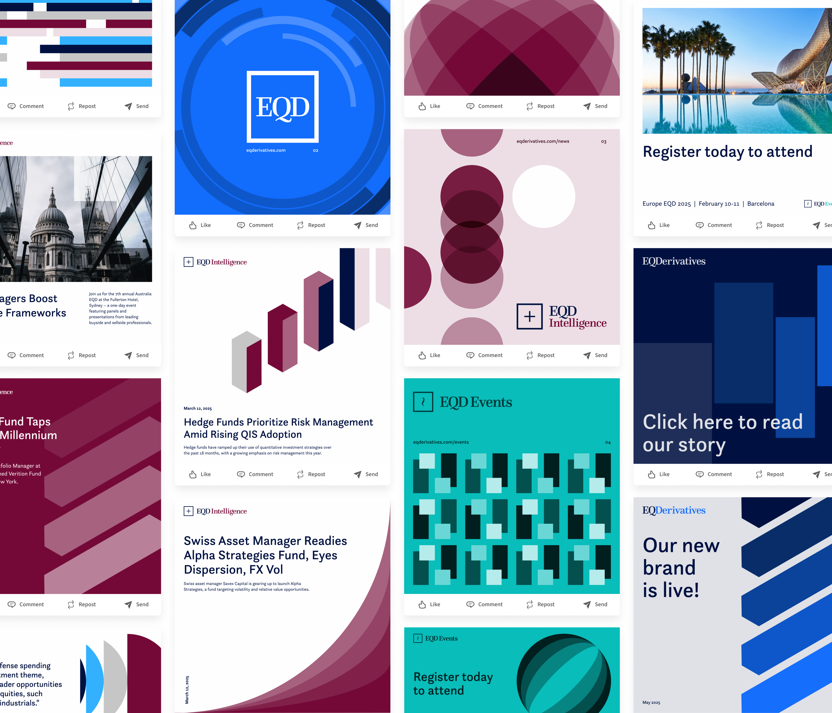
New product naming called for a clean and consistent approach to sub-branding. A new set of logo extensions were developed using existing type treatments with the addition of new logo marks.
Purposeful use of the new colours for sub-brand specific collections helped reinforce and define each EQD product.


Creating rules and defining an image strategy played a large part in the overall brand aesthetics.
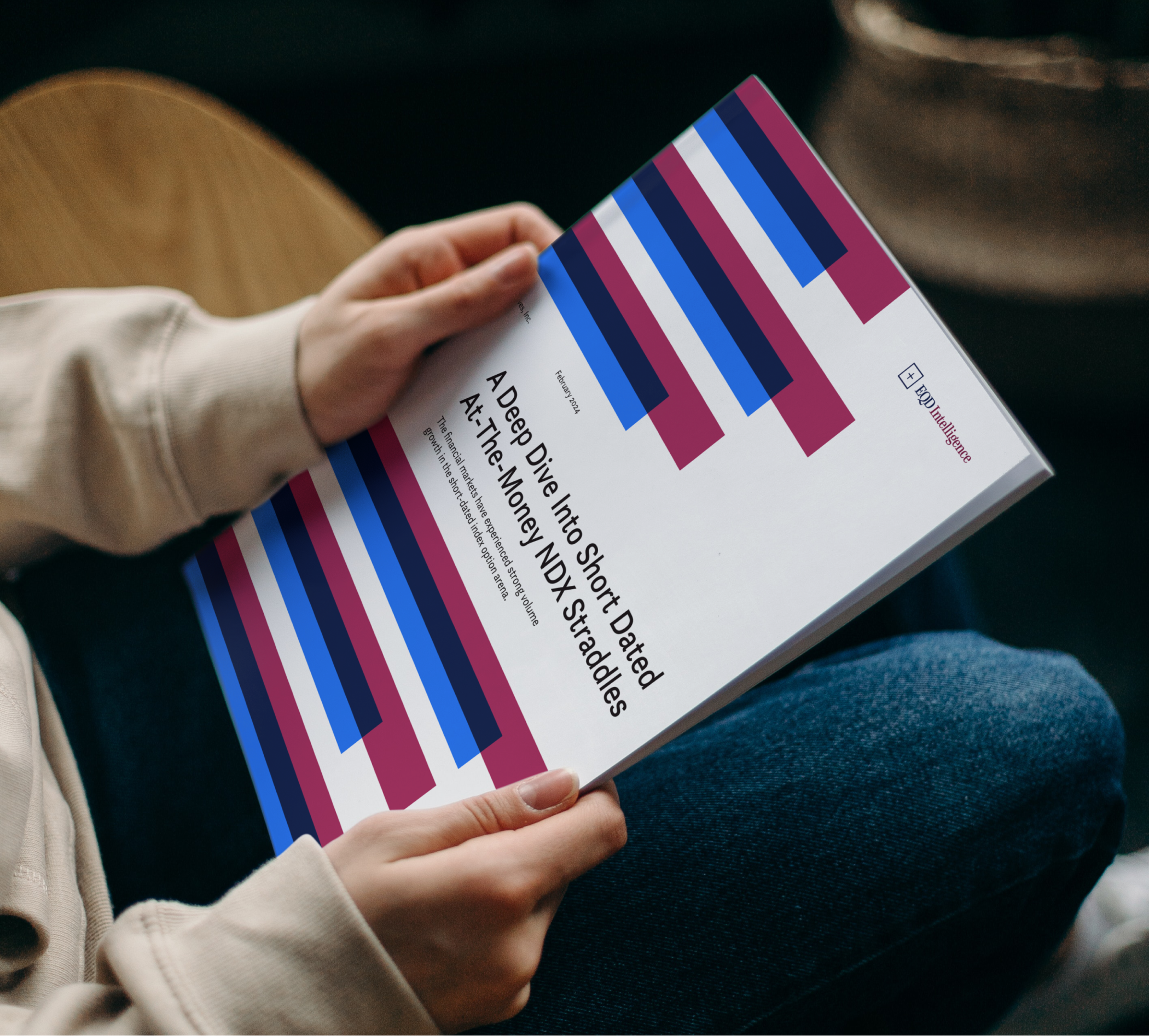
Introducing complex, natural textures and patterns to depict abstract themes, complimented by documentary style images for event locations. It was important to showcase EQD as keen observers of the real world.

A newly created and widely used set of illustrations and pictograms were developed, creating a timeless but fresh and energetic treatment to the visual identity.


Credible & Unbiased
The new illustration style naturally embodied EQD’s core values. Being credible and unbiased, meant they leveraged data and facts to back up their promise: Helping professionals get better at their roles whilst generating positive returns.
EQD pioneer relationships and connections within the derivatives community. Inspired by a mid-century Bauhaus style, clean and precise, the illustrations capture abstract data visualisations with a sense of boldness, movement and connection.
The versatile, geometric system of shapes illustrate the company’s services, whilst being deeply familiar with their financial markets audience.


”
Lucas Media invested the time to deeply understand both our internal dynamics and the needs of our clients. The result was a refreshed brand identity that exceeded our expectations—bold, youthful, and distinctly premium. We proudly unveiled the new brand at our Global EQD event in Las Vegas, where it was met with an overwhelmingly positive response. We look forward to continuing our creative partnership with Lucas Media on future initiatives.
Laura LalindeCEO — EQDerivatives, Inc